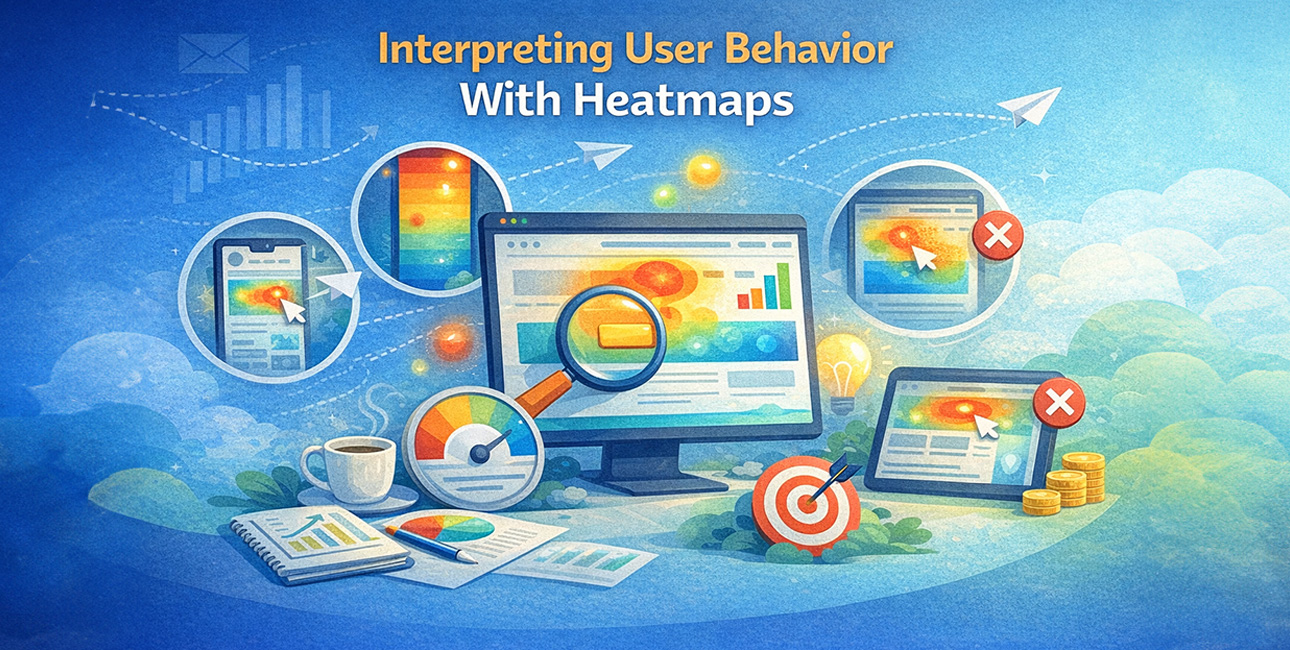
Understanding how users interact with your website is crucial for improving engagement, increasing conversions, and reducing bounce rates. But traditional analytics tools — like Google Analytics — often show what happened (e.g., page views or bounce rate) without explaining how users behave on the page. That’s where heatmaps come in.
Heatmaps visualize user interaction data as color‑coded overlays, revealing where visitors click, scroll, and move their mouse. They provide a visual representation of user behavior that helps uncover what parts of your site are working (or not), at a glance. In this article, we’ll explore what heatmaps can tell you, what they cannot, real use cases, and how SMBs can use them effectively.
1. What Heatmaps Are and Why They Matter
A heatmap is a graphical representation of user behavior data using colored overlays — warm colors like red and orange indicate high activity (e.g., lots of clicks or deep scrolling), whereas cool colors like blue and green show areas with lower engagement.
Unlike raw analytics numbers, heatmaps let you see patterns of behavior visually, giving a quick snapshot of how users interact with your webpage. Businesses use them to identify UX issues, optimize layouts, and improve key conversion points like forms, CTAs, and menus.
Heatmap types commonly include:
- Click Maps: Show exactly where users click (or tap) on a page.
- Scroll Maps: Reveal how far down a page users scroll.
- Movement/Attention Maps: Track cursor movement and attention zones. These different views help you understand not just that users visited a page, but where they focus their attention.
2. What Heatmaps Can Tell You
Heatmaps are powerful because they turn numeric data into intuitive visual insights that highlight user behavior patterns without requiring advanced analytics skills. Here are some of the most useful things they can reveal:
2.1 Where Users Click Most
Heatmaps show the parts of a page where users click most often in an easy‑to‑read color gradient — red zones mean high activity, while blue zones show little interaction. This can reveal which buttons, links, or visuals attract attention.
Example: A landing page may have a CTA button placed low on the page, but heatmap data could show most users never scroll that far — prompting you to move the CTA higher for better conversions.
2.2 How Far Users Scroll
Scroll heatmaps reveal how far visitors go down the page. Pages where most users stop before seeing key content may be too long or poorly structured.
Example: If 70–80% of visitors never reach a pricing or contact section, that’s a strong signal to restructure the copy and elements so that critical information appears earlier. Businesses often find that core conversion content needs to be “above the fold.”
2.3 Drag Attention Patterns
Movement or attention heatmaps show where visitors move their cursor — often correlating with eye movement — giving an idea of where people pay attention most.
This helps refine layouts and prioritizes visual hierarchy so that high‑value elements get the attention they deserve.
2.4 Reveal UX Friction
Heatmaps can expose user confusion, such as clicking on non‑interactive elements out of expectation or repeated clicks on broken links. These “rage clicks” are a strong UX signal and can indicate usability issues that traditional metrics miss.
3. What Heatmaps Can’t Tell You
Despite their usefulness, heatmaps have limitations. They give you visibility into user actions, but not motivation or intent. Here’s what they won’t tell you directly:
3.1 They Don’t Explain Why
Heatmaps show where users interacted, but not the underlying reason for that interaction. A lot of clicks on a button might indicate interest — but it could also suggest confusion if the button isn’t working or doesn’t lead where users expect.
For example, heatmaps won’t tell you why visitors ignore your premium offering. For that, you need to combine heatmap insights with qualitative feedback like surveys or user interviews.
3.2 Limited Context Without Other Tools
Heatmaps alone provide only a snapshot — they do not show user journeys, demographic segments, traffic sources, or other conversion funnel stages. To truly understand behavior, heatmap insights must be paired with tools like Google Analytics, session recordings, or feedback forms.
3.3 Not Always Accurate for Dynamic Content
Modern websites often display different content dynamically. Heatmaps can struggle to track interactions across varying page states (e.g., expanded menus, logged‑in vs. logged‑out views). This can reduce accuracy and lead to misinterpretation.
3.4 Device Variations Matter
Heatmaps may show different results on desktop vs. mobile. A click hotspot on desktop might not translate the same way to mobile touch interactions. Heatmaps alone won’t unify behaviors across devices unless the tool specifically supports device‑segmented tracking.
4. When Heatmaps Drive Real Business Value
To get the most out of heatmaps, use them as part of a broader optimization strategy, not as a standalone solution.
4.1 Optimize Landing Pages
Heatmaps can show whether visitors are noticing your key CTAs or ignoring them. If people aren’t scrolling down to an offer, redesign the hero section or reorder content for quicker engagement.
4.2 Improve Conversion Funnels
Track how users engage with forms, pricing tables, or service pages. If users click a service but never convert, heatmaps help identify where they get stuck.
4.3 UX Refinements Without Guesswork
Instead of guessing which button color or layout works best, use heatmaps to see where visitors naturally focus their attention — informing data‑driven design adjustments.
4.4 Validate Design Hypotheses
When testing new layouts, heatmaps show whether users interact with redesigned elements as intended. Whether it’s a new CTA color, navigation menu, or image placement, visual data reveals what actually works.
5. Best Practices for Using Heatmaps Effectively
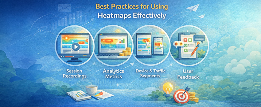
Heatmaps are most effective when they’re interpreted alongside other analytics and research:
5.1 Combine with Session Recordings
Watch actual user sessions to see the context behind clicks. This adds depth to what heatmaps show, helping reveal hesitation, confusion, or intent.
5.2 Pair With Analytics Metrics
Use heatmap insights alongside page metrics like bounce rate, session duration, and conversion rates. This helps determine whether engagement correlates with business outcomes.
5.3 Segment by Device and Traffic Source
Heatmaps might show different patterns for mobile vs. desktop or new vs. returning users. Segmenting data helps refine UX tweaks more precisely.
5.4 Gather Qualitative Feedback
Heatmaps show what users do — surveys and feedback tools help explain why. Combining both unlocks deeper user behavior insights.
6. Common Mistakes to Avoid With Heatmaps
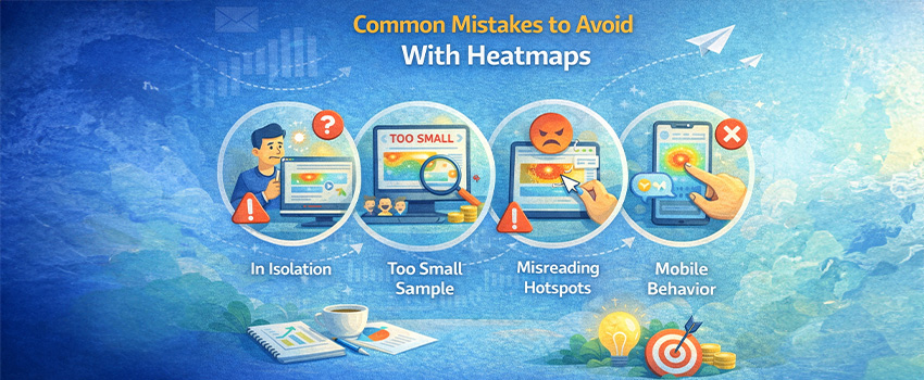
Even valuable tools can be misused. Watch out for these pitfalls:
- Interpreting Heatmaps in Isolation: Avoid making decisions based solely on color patterns without supporting data.
- Ignoring Sample Size: Heatmaps based on too few sessions can mislead. Aim for thousands of sessions before drawing conclusions.
- Misreading Hotspots: A visually “hot” area isn’t always positive — it could be frustration clicks if users repeatedly click elements that aren’t interactive.
- Overlooking Mobile Behavior: Heatmaps can behave differently across devices; mobile gestures like swiping or zooming may not always be tracked accurately.
7. How Web Dominance Can Help You
Effective email segmentation transforms your campaigns from generic blasts into personalized journeys that resonate with each subscriber. By grouping customers based on behavior, preferences, and engagement, SMEs can boost open rates, CTRs, and conversions while reducing unsubscribes.
With the right strategies and support from Web Dominance, your business can implement automated, high-engagement email journeys that drive growth, loyalty, and measurable results.
- Advanced behavioral analytics setups, including heatmaps, session recordings, and event tracking.
- Comprehensive UX audits to identify friction points and conversion blockers.
- Data‑driven site optimization plans tailored to your business goals.
- Ongoing performance monitoring and iteration to ensure continuous improvement.
Whether you’re a local business wanting to improve online engagement or a service provider aiming to refine lead funnels, Web Dominance helps you extract meaningful insights from user behavior data and translate them into growth.
Heatmaps Are Insightful — But Not Enough Alone
Heatmaps are invaluable for visualizing user behavior and uncovering usability issues that traditional analytics can’t reveal. They help you see where users engage, where they hesitate, and where they drop off.
But heatmaps also have limitations: they show what users do more clearly than why they do it. For deeper understanding, pair heatmap insights with analytics metrics, session recordings, and user feedback.
With the right strategy — and the right partner like Web Dominance — you can turn raw behavioral data into actionable improvements that boost engagement, streamline user journeys, and drive conversions.
Want to move beyond guesswork and make data‑backed UX decisions that get real results? Web Dominance can help you interpret user behavior with heatmaps and craft optimization strategies that drive measurable business growth.