Picture walking down a busy street – every storefront, every billboard competing for your attention. Yet only a handful of logos truly catch your eye. Wonder why? The secret lies in how brand identities evolve, adapt, and sometimes even return to their roots.
Take Burberry’s bold move – bringing back their century-old knight-and-horse emblem proves that sometimes the old ways work best. Meanwhile, blue shades dominate 30% of top brand identities, showing us that certain colors never lose their magic.
The logo landscape of 2025 reads like a story of contrasts. Heavy-weight typefaces make strong, confident statements, while friendly lowercase letters invite customers closer. Red stamps its authority across fresh rebrands, and typography transforms from mere letters into artistic storytelling.
Ready to discover what makes a logo unforgettable in 2025? Let’s explore how brands dance between innovation and tradition, creating visual identities that truly stand out in today’s crowded marketplace.
The Evolution of Logo Design: From 2024 to 2025
Ever noticed how brand identities seem to shift like seasons? The logo design world just took an unexpected turn. Gone are the days of cold, clinical minimalism that dominated our screens. Today’s brands crave something different – they want their logos to tell stories, spark emotions, and yes, even smile back at their customers.
Key shifts in design philosophy
You know that feeling when everyone’s wearing the same outfit to a party? That’s exactly what happened with minimal logos – they all started looking alike. Now designers are breaking free, experimenting with more expressive elements like hand-drawn touches, flowing waves, and organic fonts that breathe life into brands.
Think of your logo as the lead singer in a band. Sure, it’s important, but these days it needs backup singers too. The most successful brands now surround their logos with supporting elements – patterns, textures, animations – creating a complete visual symphony.
Here’s what catches eyes in 2025:
- Real, human touches that feel genuine
- Playful elements that show personality
- Unique approaches that refuse to blend in
- Simple yet unforgettable visual stories
Remember this – even tiny tweaks to your logo can completely change how people see your brand.
How consumer preferences are changing
Let’s face it – today’s customers can spot fake authenticity from miles away. They’re not just looking at logos anymore; they’re looking through them, searching for real brand stories and genuine connections.
What makes a logo click with customers now? It’s all about showing who you really are – your values, your dreams, your personality. That’s why hand-drawn elements feel so right – they’re perfectly imperfect, just like us.
Here’s something fascinating – brands are literally putting smiles on their logos, taking cues from Japan’s ‘Kawaii’ culture. Sounds quirky? Maybe. But it works because people crave emotional connections, not corporate coldness.
The influence of digital platforms
Mobile screens changed everything. When’s the last time you browsed a website on desktop first? Exactly. That’s why responsive and mobile-friendly business logos aren’t just nice to have – they’re essential. Smart designers create logos that gracefully simplify as screens shrink.
Your logo in 2025 needs to be a digital shapeshifter – looking sharp on websites, social media, apps, and ads. Those tiny profile picture circles? They’re calling the shots now.
No wonder major brands are embracing bold simplicity. When your logo needs to perform everywhere from Instagram stories to email signatures, keeping things clean and flexible isn’t just smart – it’s survival.
Top Color Trends Dominating Logo Design in 2025
Colors speak louder than words in visual branding. Just like fashion, color preferences in logo design shift and evolve. The palette choices of 2025 tell fascinating stories about how brands want to be perceived, remembered, and loved.
The royal blue renaissance
Remember that perfectly tailored blue suit that makes everyone look professional? That’s what royal blue (hex code #4169e1) does for logos in 2025. This isn’t your standard navy – it’s got more punch, more personality. The shade carries quite a story too, born from a dress design competition for Queen Charlotte back in the 19th century. Talk about royal treatment!
True blue (#137dc5) didn’t climb into the top ten most popular branding colors by accident. It’s like the Swiss Army knife of colors – pair it with fiery orange for drama, or tone it down with soft grays for sophistication. Smart brands love this flexibility, using royal blue to whisper “trust me” and shout “notice me” at the same time.
Red's powerful comeback
Red just staged the comeback of the century. After playing it safe for years, brands are falling head over heels for this attention-grabbing hue. Cherry red tops Pinterest’s trend predictions, proving that bold is beautiful again.
Paint giants caught the red fever too. Behr crowned “Rumors” as their color champion – think 90s nostalgia with a modern twist. Sherwin-Williams jumped on board with “Borscht” for the classic crowd and “Red Tomato” for the young and restless.
Why this red renaissance? Simple psychology at work – red screams excitement, passion, and yes, even makes you hungry. Just ask Coca-Cola, Netflix, and YouTube – they’ve been playing the red card successfully for years.
Typography Revolution: Fonts Shaping Trending Logo Designs
Ever stared at a logo and felt something without knowing why? Chances are, it’s the typography doing the heavy lifting. A recent survey of 25,000 customer logos revealed that 29% used stylistic, creative fonts to tell their brand stories. Let’s decode how letters became the silent storytellers of 2025.
The rise of condensed sans serifs
Picture squeezing a powerful message into a tiny space – that’s what condensed sans serif fonts do best. These space-savvy typefaces pack quite a punch while staying crystal clear. Think of them as the perfectly tailored suit of the font world – slim, sharp, and commanding attention.
Want proof? Just look at Herman Miller and RSPCA’s fresh makeovers. Both brands picked heavy-weight, condensed sans serifs that work like magic across different industries. The secret? These fonts squeeze more words into tighter spaces without losing their cool.
Here’s something that might surprise you – about 90% of internet users prefer reading in sans serif fonts. Makes sense, right? These clean-lined champions shine on screens where every pixel counts.
Artistic typography taking center stage
Remember when fonts were just… fonts? Not anymore. Today’s designers are turning letters into art pieces, playing with exaggerated strokes and playful connections between letters. It’s like giving each brand its own handwriting.
Speaking of handwriting – it’s having quite the moment. In our digital world, handwritten fonts feel like a warm hug. Those little imperfections? They’re not bugs, they’re features – making brands feel more human in our polished digital world.
Funny how it works – the more AI takes over design, the more brands crave custom typography. It’s like having your own signature in a world of typed emails.
Lowercase simplicity vs. bold statements
Two font personalities are fighting for the spotlight in 2025. In one corner, we’ve got the friendly lowercase letters – think of them as the brand next door. Gustini pasta gets it – they switched to lowercase specifically to vibe with TikTok’s crowd.
In the other corner? BOLD CAPITALS that practically shout confidence. Tech companies and fashion brands especially love this approach. Just look at Balenciaga – their uppercase letters strut down the digital runway like they own it.
These opposing styles show us something fascinating – typography isn’t just about reading words, it’s about hearing their voice. Some whisper, others shout, but each has its perfect audience.
Technology's Impact on Modern Logo Design Trends
Think of technology as the invisible hand reshaping how we create and experience logos in 2025. Just like a master chef with new kitchen tools, designers are cooking up fresh possibilities that blend technical innovation with creative flair.
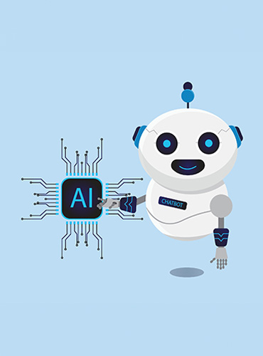
AI-generated logo esthetics
AI tools have fundamentally transformed how we craft logos today. These smart tools dive deep into customer preferences, helping brands build visual identities that truly connect [6]. Small businesses and startups who once dreamed of custom logos? They’re finally getting their chance.
But here’s the plot twist – AI isn’t pushing designers out of their jobs. Instead, it’s becoming their new best friend. According to Deloitte, generative AI has become a major force in shaping our creative culture, giving early birds quite an edge. Smart designers now let AI handle the boring stuff while they focus on the creative magic.
The AI touch in logo design? You’ll spot it everywhere. These tools craft designs based on company values and style preferences. But something funny happened along the way – designers started creating deliberately imperfect, human-looking designs. It’s like a rebellion against machine perfection.
Motion and adaptability in static designs
Logo design in 2025 feels more like choreography than drawing. Dynamic logos dance and shift based on where you see them. These aren’t your grandmother’s static symbols – they’re living, breathing brand ambassadors.
Motion graphics don’t just catch eyes – they grab hearts. When your logo moves thoughtfully across social media, it tells a deeper story. But before adding motion, designers ask themselves: where will this logo live, and what’s the real story behind it?
Here’s the tricky part – motion needs purpose. Too much wiggle and shake? That’s just showing off. The best animated logos move with meaning, telling your brand story through every twist and turn. One designer put it perfectly: “If a picture is worth a thousand words, an animation is worth a million”.
Industry-Specific Logo 2025 Trends
Different industries, different logo stories. While some design elements work everywhere, each business sector puts its own spin on visual branding. Let’s peek into how different industries are making their marks in 2025.
Tech and startup visual identities
Tech companies and startups dance to their own beat when it comes to logos. Their golden rule? Shape-shifting designs that morph based on context, mood, or audience .
Here’s what catches eyes in tech:
- Geometric patterns that draw you to a central point
- Clean, bold designs that look sharp on any screen
- Custom letters that scream "this is us"
Watch how Chat GPT and Perplexity influenced the scene – those circular patterns popping up everywhere. Smart move, really. These simple shapes help startups look stable and trustworthy, exactly what they need when building credibility .
Retail and consumer goods approaches
Green isn’t just a color anymore – it’s a movement. Retail brands get this. Their logos now speak the language of sustainability through earth-inspired patterns and organic shapes . Smart thinking, considering how today’s shoppers vote with their wallets for planet-friendly brands.
But here’s something fascinating – old school is new school again. Take Jack Daniel’s – they barely touched their vintage look, and guess what? People trust them more for it . Joan Costa calls this “consistency” in visual speak – that familiar feeling that makes you reach for one brand over another.
Service industry differentiation strategies
Service businesses face a tricky challenge – standing out in a sea of sameness. Their solution? Making logos that don’t just catch your eye – they catch your ear, your touch, even your nose. Pretty clever way to stick in someone’s memory.
Those fancy badges and crests you’re seeing everywhere? Not just pretty pictures. Paired with modern gothic fonts, they’re secret weapons for service providers . They say “trust us, we’ve got this” without saying a word – exactly what you want when building client relationships based on trust.
Conclusion
Picture walking into an art gallery where every piece tells a different story. That’s logo design in 2025 – a beautiful mix of bold and subtle, traditional and new. Gone are the days of playing it safe with minimal designs. Today’s brands paint with confident strokes of royal blue and cherry red, while condensed sans serif fonts speak volumes across our screens.
Sure, technology plays its part – like a master craftsman’s new tools. AI lends a helping hand with the basics, while motion graphics and AR add sparkle to the show. But here’s the thing – the human touch? Still irreplaceable. The best logos in 2025 dance gracefully between innovation and timeless design wisdom.
Different industries tell their stories differently. Tech brands love their geometric patterns – clean, sharp, modern. Retail? They’re going green, literally, with earth-friendly designs that speak to conscious consumers. Service providers? They’re bringing back those trusty badges and crests, proof that sometimes old school works best.
Looking ahead? Logo design feels more like conversation than decoration. Smart brands know this – they’re crafting visual stories that shift and adapt, yet stay true to their core. It’s not just about looking good anymore – it’s about connecting, engaging, and yes, sometimes even surprising your audience across every platform they call home.